Graph Diamonds: The Year in 5 Telling Charts
 RAPAPORT... Data can be exhilarating. Earlier this week, Avi Krawitz,Rapaport's News Editor and Senior Analyst, called this reporter over to look athis screen, as there was something exciting on it. The attraction was a linechart of the RapNet Diamond Index (RAPI?,,?) for 1-carat diamondsthroughout 2018, showing that the peak price on July 6 coincided exactly withthe day the US implemented its first China-specific tariffs. The index dropped throughthe end of the year.He later beckoned a few more colleagues over, and there wassoon a modest clamor of interest around his workstation. By the end of the day,even the office administrator was asking, "Did you see that graph?" Charts can, it appears, tell a story in ways that wouldrequire many words. So we've decided to relive 2018 through five pieces ofvisual data about the diamond and jewelry trade.1. Small-stone pricesslumped in the second half.The RAPI for 0.30-carat polished fell from an early-Julyhigh point due to an oversupply, as well as macroeconomic factors such as theUS-China trade war, with the category usually popular in China. While there was a similar trend inAvi's 1-carat graph, the 0.30-carat category shows it more clearly. This index jumped9.9% between January 1 and July 6, but ended the year down 1.1%.
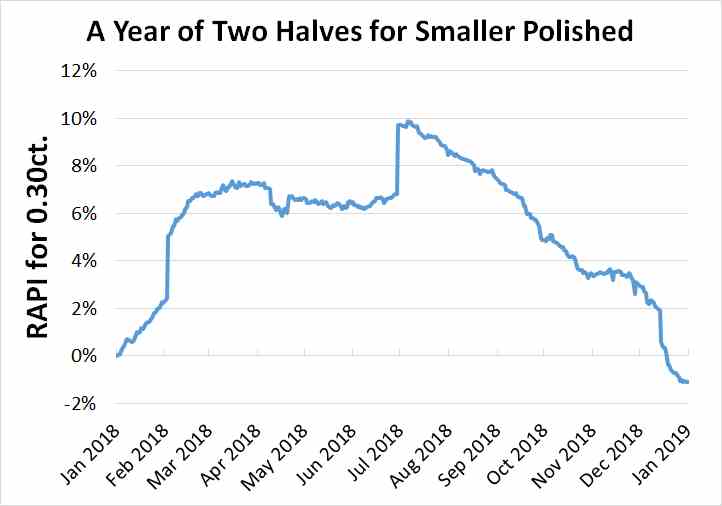 Source: Rapaport2. Traders embraced larger diamonds. The industry focused on higher-value polished in response tothe weakness in the smaller categories. That was visible in India's exportdata, which showed growth in the average price of the nation's outboundpolished shipments up to November.
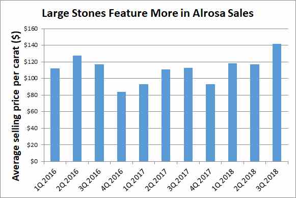
 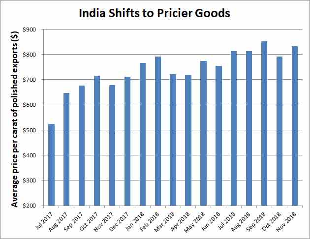 Source: Gem & Jewellery Export Promotion Council;Rapaport archives3. Rough demandfollowed suit.
Alrosa's average rough-diamond selling priceincreased 19% to $123 per carat in the nine months to September amid a shift in demand away from smaller goods toward larger stones. It also noted a 5.2% increase in like-for-like pricesduring that period.
 Source: Alrosa4. An oversupply was driving the changes.The midstream has struggled with a surplus of lower-valuegoods since the Gahcho Ku?(C), Renard and Liqhobong mines came on stream in late 2016 andearly 2017. Global rough production increased 19% to 150.9 million carats in2017, according to Kimberley Process data. The number of unique stones listedon RapNet jumped 24% during 2018.
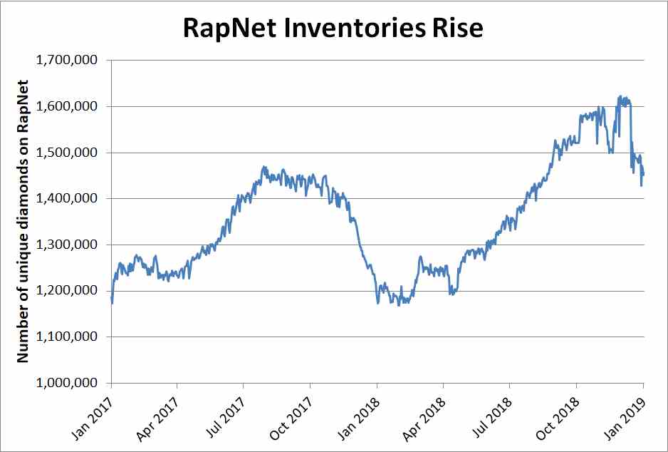 Source: Rapaport5.Memo deals becamemore common.Retailers increasingly prefer taking goods on consignment(or memo), as it reduces their risk. However, this means suppliers don't getpaid until their client makes a sale. Though this chart for Signet Jewelersonly goes up to 2017, it shows memo is becoming more central to the company'ssourcing.
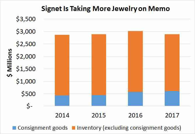 Source: Signet Jewelers annual reportsMain image: A graph on a screen. (Pxhere)