Must-See Stock Market Statistics of 2017
With only a few days left of 2017, I decided to compare some key stats from this year to other years. Also, I looked back historically to find the years most like 2017, and see how stocks performed after these extremely low-volatility grinds higher.
2017 Key Statistics: Positive Days and Low Volatility
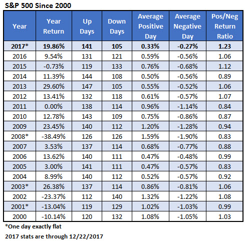
Below is a table looking at some key stats for each year since 2000. With a few days left in the year, the S&P 500 Index (SPX) is up about 20% for 2017, which ranks fourth of the overall 18 years in the table. So, this was a very good year for stocks.
Further, 2017 is one of eight years in the table in which the SPX enjoyed 140 positive days. It has been an outstanding year even though positive days averaged a gain of just 0.33%, which is the lowest of all the years. Of course, down days averaged a loss of just 0.27%, which is the most moderate in the table. In fact, that number is so low that the return ratio (0.33% divided by 0.27%) is the highest figure on the table.
As you can see from the low figures of the average positive and average negative days, 2017 was an extreme year when it comes to volatility, too. That is, it was extremely low. In fact, there have been only eight days in which the S&P 500 was up or down more than 1%. Going all the way back to 1928, only two years had fewer 1% days: 1964 had three days; 1963 had six days; and 1965 tied with this year with eight days.

Years Similar to 2017
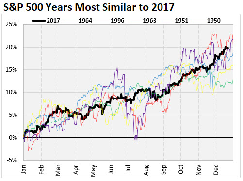
I think this is a nifty way to find years similar to 2017, while also giving us an idea about what kind of trading environment we're in. Rather than simply looking at the year-to-date return, I considered the SPX path taken throughout the year. I won't go into the details of how I determined the most like years (in short, I used a least sum of squares method), but below are the years that most resembled 2017. The low-volatility years mentioned above -- 1963 and 1964 -- are both shown below. The other years presented that smack of 2017 are 1996, 1951, and 1950.

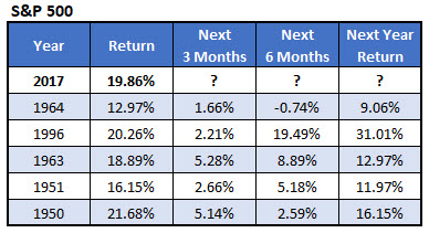
The table below shows how stocks did following those like years in the chart above. If this is any indication of what to expect, then now is the time to load up on stocks.
In the five years that had the most similar chart paths to 2017, the subsequent year was positive every year thereafter, with the SPX averaging a gain of 16%, and the worst year still generating a gain of over 9%. The first quarter of the following year was also positive each of those five years, with the S&P averaging a gain of about 3.4%. Essentially, a low-volatility, bullish year for stocks, like that of 2017, has tended to lead to more gains the following year.
